
How to Build Trust and Loyalty Through Design
Does design really impact how your brand is perceived? We break down how this ‘hidden’ visual language of design can be used to influence in branding.

Imagine you’re walking on the street on the way to buy a new pair of Ray Bans from your local high street store. You always buy Ray Bans because you know they always have high quality and timeless style.
A man appears and pushes a tray of sunglasses under your nose.
‘Want to buy some Ray Bans?’ He asks, pushily.
Now, chances are you’re going to stick to your plan and head straight to your Ray Bans shop. Why? Because you know that the street-seller’s sunglasses are fake and most likely will break with a strong gust of wind.
You trust the Ray Ban brand. You’ve established a relationship with them over time that has been cemented with value and consistency. They are not just a shop selling sunglasses, they’re an entity that you are connected to.
There are many working definitions of trust, but most revolve around the confident expectation of honest dealings, reliability, promise keeping and not being taken advantage of when vulnerable.
Consistency is Key
When developing trust, it’s crucial to be consistent with your brand identity. Brand consistency isn’t just plastering your logo on everything, your logo is only a single part of your brand. Your brand identity is the collection of colours, patterns, illustrations that make up your brand’s visual identity and style.
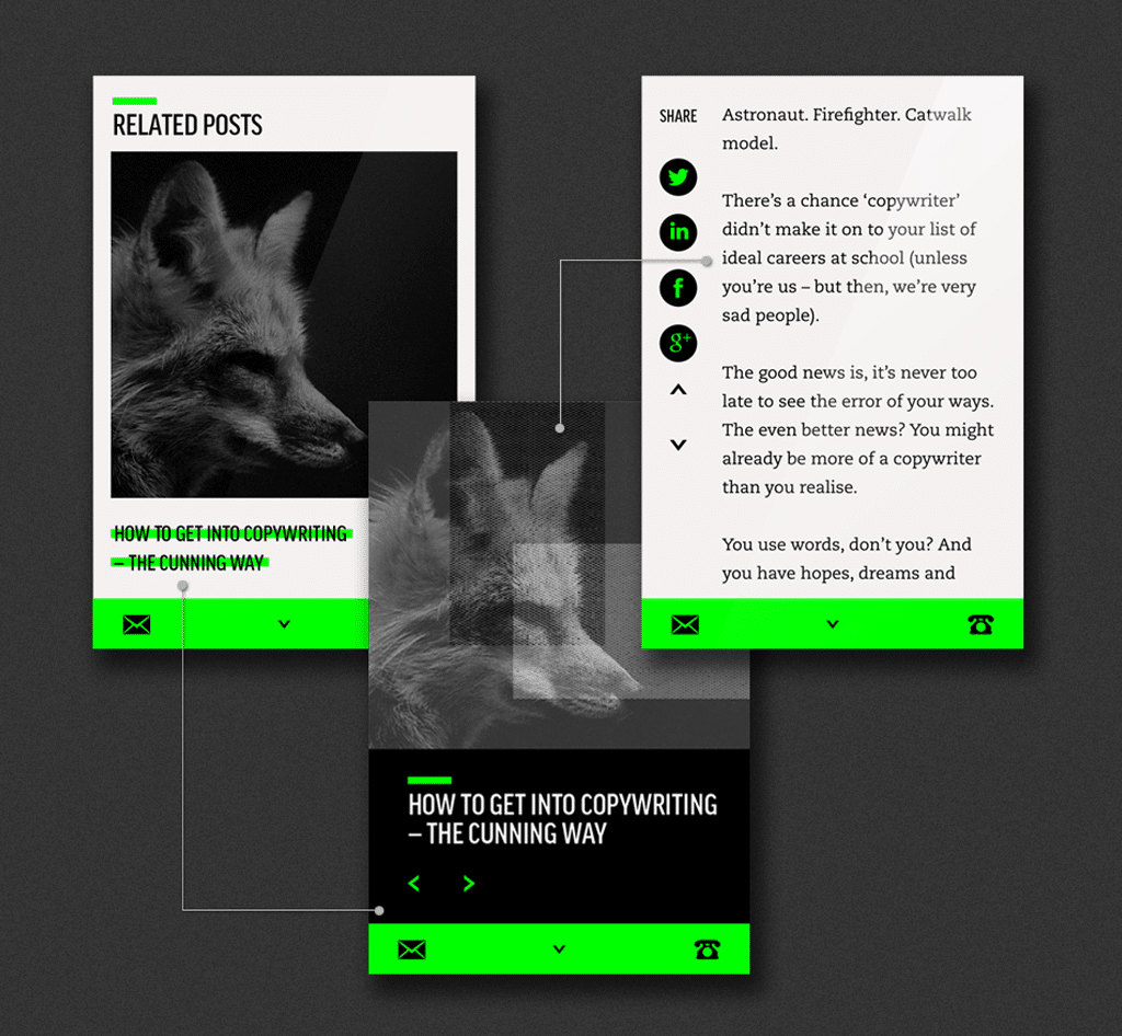
Brand identity colour green used in on website
The end result should be that if your logo was covered up on any marketing collateral, your customer should be able to tell that it’s your brand just by its distinct assets, which can be referred to as ‘codes’.
All brands have codes, which are graphical and symbolic devices that are conducive to the company or product. It’s true that a logo is a code, but a well-constructed brand’s visual elements employs patterns, motifs and colours to distinguish itself. Consistency across the board with your brand’s distinctive codes will encourage loyalty through recognition and commitment to who you say you are.
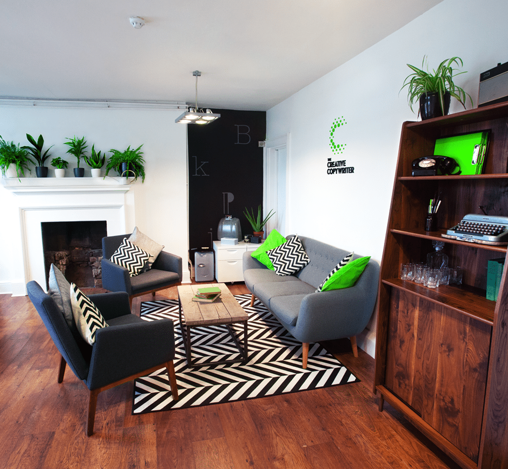
Colour of brand identity used in environment
Not only this, but every channel you communicate through has to mirror this consistency, including your website, social media, shop displays, advertising…everything straight through to employee uniforms.
Think of it this way, if a well-known friend turned up on your doorstep talking in a different accent, wearing unusual clothing and behaving in a completely different way to normal, you’d be thinking ‘what is going on here?’
You wouldn’t trust the situation and your brain would be telling you to be fearful.
Project management tool, Slack underwent a rebrand due to their logo design resulting in brand inconsistency and not accurately representing them as they grew. In this post on their blog, they candidly tell the world exactly why their logo wasn’t working for them and how they’ve changed it.
TOP TIP: Work with a branding expert to create and follow Branding Guidelines, a set of tools and rules that define your company’s individual branding elements. They ensure consistency no matter who is working on a task, and they’re easy to pass to a design company or copywriter when needed. Branding Guidelines are particularly useful when you have a marketing department with more than one person working on the brand. Following stringent guidelines prevents your brand from sliding around and will keep it future proof when new design work is created.
Take a look at these effective examples of Branding Guidelines from HubSpot for some inspiration.
Trust Touch-Points
Every touch-point of a brand should be designed to motivate trust. We all know the saying ‘never judge a book by its cover’…well, we all do it and it’s not our fault. Neurologically, the brain has already emotionally responded to something new before we have time to rationalise. We make an instinctive decision on the spot without even realising, as it helps us to keep ourselves safe.
A great designer will work on the following (with your input):
• A colour scheme [advised] by your designer and stick to it. Make sure you’re choosing colours that work well together, as a colour palette that is incongruent will automatically provoke an alarm in the brain which will have an unsettling effect.
• Use your brand identity across different apps and platforms. This repetition builds familiarity and a reputation they can believe in.
• A typeface that accurately represents your brand’s values and essence. For example, with friendliness in mind, your designer may choose a typeface that is round, has clear lettering and staying clear of sharp edges and narrow letters.
• Keep messages clear, smart, and simple and specifically tailored to your target audience.
Remember – it’s important that you approach brand design with an open mind, giving your designer creative freedom and trusting their expertise.
Here’s an example.
We worked with #0f Development, a digital marketing company that partners with UI designers and design agencies. They wanted full circle branding including naming, brand strategy, logo and identity work, UI and iconography to name a few aspects of the project.
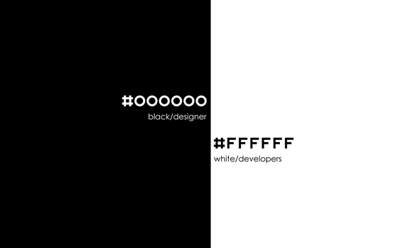
As recognition that their target audience (designers and developers) use different thought processes, creative and analytical respectively, we played on the theme of black and white to represent duality. Their name ‘#0f’ is a shortened version of the colour codes for black (#000000) and white (#ffffff), which are used in digital design and would therefore be directly targeting their audience.
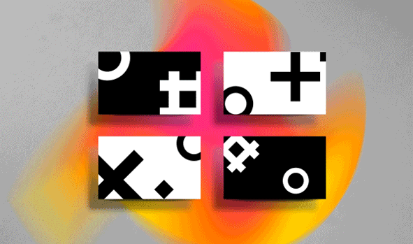
The splash of colour behind the lettering represents the explosion of creativity that occurs when these two talents merge together. Speaking directly to their customers in this way instantly creates trust as it’s familiar and shows an innate understanding of their interests.
TOP TIP: Always put aside extra budget for photography and purchasing professional typefaces. If you get these for free it will result in a cheap and unprofessional look and you’ll be more likely to achieve the look that you need…it will be worth it in the long run.
Go Pro
The best decision you can make is to seek a skilled, seasoned and professional designer to bring your design vision to life.
Any designer worth their salt will use their comprehensive knowledge of design to create the most suitable designs for your company, so that it aligns with your brand strategy.
Your brand strategy will be a comprehensive process which is tied to your business goals, working towards a balance of conceptual (the substance) and aesthetics (the emotional reaction). This way, brand design will be one part of your marketing puzzle that all works intuitively and strategically together to achieve your goals.
When we worked with Cromwell, a legal firm in London that wanted a logo and identity to use across all their collateral, one of their core values and USPs was ‘nourishing relationships both externally and internally’. We weaved the authoritative nature of the law into the design, in the form of a line and a dot which was inspired by legal documents which emphasises the idea of ‘set in stone’ and ‘official’.
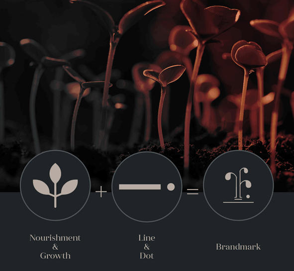
The brand mark represents a plant which is significant of the relationship that will grow when in partnership with Cromwell. The dot can also be interpreted as an apple, echoing the fruits of a flourishing relationship.

Another example is a rebrand of Alinea, a michelin starred restaurant based in Chicago. The pilcrow/alinea mark that’s used in typography to represent a new paragraph was used in their old logo as a reference to innovation, which is synonymous with their ascending brand.
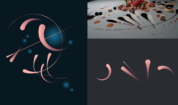
We worked on refining the logo further by adding a swoosh to the logo to represent the sauce that the restaurant is renowned for ‘painting’ on tables with. To further build on the innovative aspect of the brand, we explored the metaphor of volcanoes and their violent explosive process to express creative chefs and their innovative ideas. The rock layers of the volcano became part of the visual identity as well as inspiration for a new tagline: ‘Alinea, forging new landscapes in the culinary experience’.
Final Thoughts
Think of one of the most recognisable brands that you trust.
Why do you trust them? The chances are that you’ve learned to recognise it because of the consistency across the messaging, whether it’s written or visual and the brand resonates with you. The same brand colours are reflected across them and the language sounds familiar every time. Everything about the brand is intentional, but not obviously organised and while not boring, it’s cohesive.
This is the secret to building trust. It’s a carefully crafted cocktail of psychological understanding and applied strategic thinking.
But be careful, the well-known adage reminds us that ‘it takes years to build trust, but seconds to break.’ Be consistent, transparent and smart…the rest will follow.
“Resilience is the flexibility to respond to changing circumstances. It’s what allows brands...
“Your brand is the single most important investment you can make in your...
An interview with James Church on his book for founders seeking investment In...